
Using Exertion Load to Predict Metabolic Stress
This article needs to start with a little background info. I originally developed Exertion Load because I needed a single input for weight training stress that I could input into a performance model I wanted to use. I couldn’t use Volume Load (sets x weight x reps) because that left out critical info about how intense the workouts were. Similarly, intensity left out info about the volume. On top of that, how do you compare a week of volume based training to a week with intensity based training? With these questions in mind, Exertion Load, as presented in the last article, seemed to do the job.
Not everyone had the same interest, though. Lot’s of people were more interested in its application in predicting hypertrophy from different types of workout structures. It looks promising in that regard as well, however, without directly studying and validating it in a research study, it isn’t really more than something that looks good on paper (yet).
But we don’t need to wait for those studies to be funded and taken to the conclusion because there are indirect ways to prove it’s utility in the prediction of hypertrophy. However, before we get started on that, we should attempt to formulate Exertion Load a little bit more rigorously. Ready? Let’s do it.
The Clean Up
Let’s say you are 95% certain that A gives B. Now let’s say your entire chain of reasoning involves 15 such connections and you are equally certain about all of them (95%). That sounds really solid. Surely, your well-constructed chain of logic must be correct.
None of the connections is weak on its own, but when strung together in a chain, the uncertainty multiplies. Most people probably don’t know that. You may think your conclusion is also 95% certain but it’s actually about 46% certain. That meticulously crafted argument, based on strong points at each and every step, isn’t any more certain than a coin toss. Sorry.
If you wanted to be 95% sure at the end, you’d need to raise your standards on each step to about 99.7% certainty. Let me just say this as the biggest understatement of the year, but that’s not easy to do.
(Uncertainty propagation is interesting if you ever want to look into it.)
So here’s a trick I have learned if you want to avoid wasting a bunch of time — take you and your ideas out of the picture. Don’t put your fingerprints on any part of the process. Why? Because you already have an idea in mind. You’re looking for it and as careful as you are, that will bias the outcome. Any time you insert your assumption as part of connecting two dots, that’s a fingerprint. You took A and, through your reasoning, connected it to B. Is that connection absolutely unshakable? Most likely not. But then you raced ahead in excitement and connected it to the rest of the alphabet. Congratulations, you’ve finger-painted the picture you were looking for. I’m brave enough to admit having done that on many occasions. Lesson learned and time wasted. No fingerprints on this then.
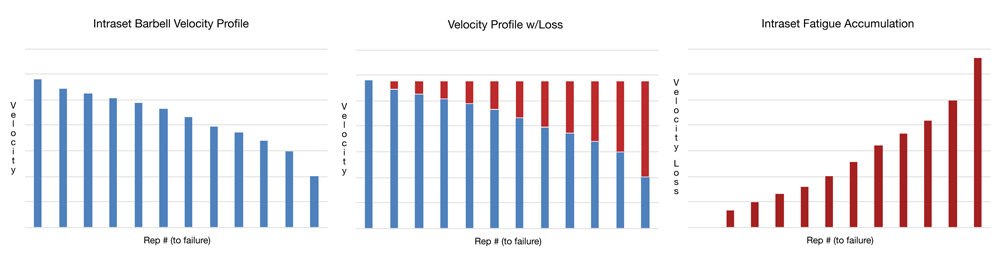
The above is raw and reproducible data. You, or anyone, could measure velocity across a set to failure and get pretty much the same thing. Yet there is one fingerprint here. Can you see it? It’s where velocity loss is reconceptualized as fatigue. That certainly sounds reasonable but let’s not make any assumptions at all. So let’s drop the new terminology and simply call it a profile of velocity loss across a set. That might seem pedantic, but that’s how we avoid wasting time. No fingerprints. I will not fill in the blanks with my expectations in any way.
Let’s now assemble the data into a model of velocity loss we can play with. Looking at the bars in the final chart, they seem to increase non-linearly. Fitting the data points to both a line and an exponential confirms that the data is slightly better modeled by an exponential (R^2 0.95 vs 0.96). Actually, there is an even better fit with a parabola (R^2 0.97). But that doesn’t make much sense outside this rep window. So let’s drop that and go with the exponential. It’s only a small improvement over the linear fit, but I’ll take what I can get.
 This is what I did in the previous article. But you, careful reader, have found another fingerprint — I made a judgment call and selected a curve from three options and used it to model velocity loss. There doesn’t seem to be anything wrong about that choice. The parabolic curve over-fit the data and would not generalize outside the given range. Meanwhile, the straight line fit well, but an exponential fit better. And yet there is something wrong with the right choice. Can you see it?
No, stop lying. You don’t see it because we don’t have the complete picture, yet. In this frame, it’s the right choice. But in a larger frame, it’s the wrong choice. Tricky stuff. (I’ll get to it in a bit.)
Exponential velocity loss model in hand, we took it for a spin last time and summed up the cumulative loss across a set. That gave us a constant for each rep in the range of 0 to 1, which we used to discount the early reps in a set since they subjectively feel easier. Makes sense.
Next, the output of this model was compared to a selection of the available literature and things looked good in terms of making predictions for training stress and related changes in strength and muscle mass. Case closed. Well, not so fast.
Summation of velocity loss was another fingerprint but the finger painting went really wild when examining the literature and pulling out supporting data. Taking a step back, let’s do some house cleaning to see if we can wipe those fingerprints off of everything.
More Clean Up
First, why multiply by the mass for each rep, as is traditionally done with volume load? That’s conceptual baggage. We already have an indicator for the intensity with Reps + RIR. If you do a squat with a heavier weight, your Reps + RIR value is lower. Done. Mass is redundant. So now what do we have if we sum across reps? Nothing more than a sum of velocity losses.
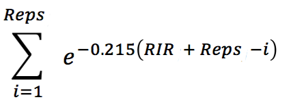
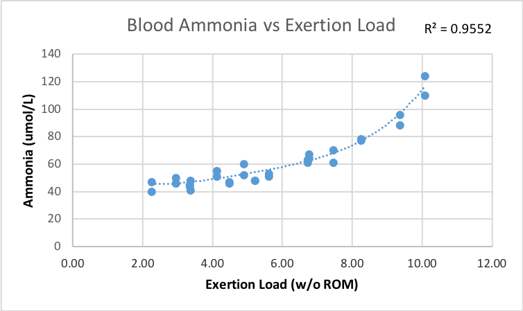
Can this be used to predict any concrete real-world measurements? It turns out that Sánchez-Medina & González-Badillo successfully used mean velocity loss, measured as the difference between the first and last reps, to almost perfectly predict metabolic stress (blood concentrations of lactate and ammonia). Metabolic stress is interesting here because it is thought to play an important role in the hypertrophy response to weight training.

This study provides data on both Reps + RIR and metabolic stress. So, of course, we’re going to have to test how well Exertion Load does. Testing it out, the results show that my model gives an R^2 of 0.84 vs the authors’ 0.93 when applied to predict the lactate response. Bummer. Back to the drawing board then.
I mean, 0.84 is not that bad and Exertion Load doesn’t require any hardware to monitor velocity loss. All you need is Reps + RIR and a calculator. But I had higher expectations. Maybe it can still be saved. Let’s see if there is anything I can do.
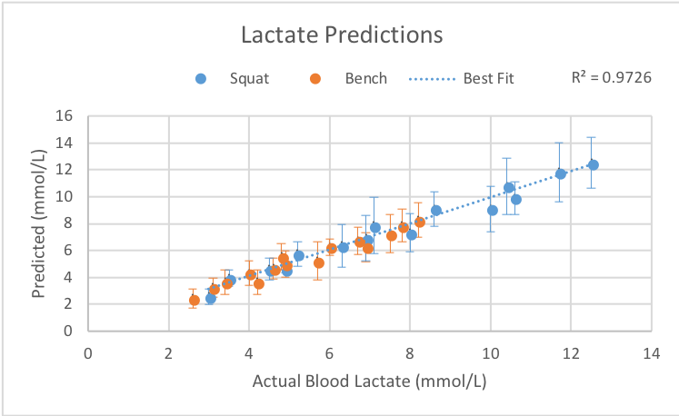
The very first fingerprint on this model came from the selection of the curve (i.e. linear, exponential, or parabolic). Let’s start with that. Since we ruled out the parabolic curve, that leaves the linear fit as the only other option. It turns out that if you ignore the last two reps before failure, the linear curve actually fits better than the exponential (R^2 0.98 vs 0.96). Those last two reps are what tips the overall fit. Drop those two and a straight line fits better. So, is that really a big deal? These are such minor differences in the goodness of fit.
Think about what we’re really doing. We’re summing the effects of each rep. If we have a 12 rep set and we get a better fit for 10 of the reps, it might be ok that 2 don’t fit as well. It’s like multiplying the goodness of fit improvement by a factor of 10. Now that’s not so minor anymore. Back in business, then. Let’s try the linearized version of velocity loss and see how it stacks up to the challenge of predicting the lactate response.
Drum roll, please… R^2 for the new version is 0.97. Boom. Confidence restored. That also beats the author’s 0.93.

The only inputs are Reps & RIR. That’s it. No external equipment required. No blood samples. None of that. We’ve now got a very simple model that does an excellent job predicting a marker for metabolic stress during weight training. And there aren’t many fingerprints on that either. It’s about as stripped down as you can get.
Solid.
There aren’t very many holes you could poke in this. But you’re welcome to try.
Okay, back to reality. What about those two reps we orphaned to make that big improvement in the overall model? Something is up with those two and I want to know what it is. But before we get into that let’s dig a little deeper with what we’ve got.
Here’s what predicted blood lactate concentration looks like after three sets to failure with 1 to 20 reps (3×1 to failure, 3×2 to failure, etc.). Baseline blood lactate at rest is typically below 2 mmol/L so it looks like 1RMs don’t produce any significant metabolic stress above baseline.

Here’s a little bit of interesting trivia: in the world of aerobic training, the lactate threshold is usually around 4 mmol/L. That is the point at which lactate accumulates in the blood faster than it can be removed — a significant training landmark. That point is not crossed on this curve until 3x3RM.
I don’t what to extrapolate the curve out too far into high reps, but lactate peaks at 3x15RM here and stays there as reps per set increases to 3x20RM. I would guess that lactate eventually starts declining again when set intensity decreases enough that your body is able to clear lactate as it’s produced. That’s how it works for short, medium, and long distance runs or swims, for example. For now, we can say that sets of 15 and 20 produce equivalent metabolic stress. However, sets with 15 will give you slightly more mechanical stress.
I also want to mention that Sánchez-Medina & González-Badillo collected metabolic data for both the bench press and squat exercises. The above graphs come from the squat data set. In their paper, they fit velocity loss to lactate separately for each exercise. I think our exertion load model would not be that interesting if it only works for one exercise. So let’s get it working with the bench press too in a way that we can extend to other exercises.
To do that, I’ll introduce a third term — the range of motion (ROM), which is simply a constant for each exercise. With that added to the picture, let’s go back and test it out on predicting both the bench press and squat blood lactate concentrations at the same time.
Okay, not bad. That gives us a way to compare all kinds of exercises. Notice that the squat can lead to higher lactate concentrations. That’s probably why so many of us absolutely love high rep squat sets to failure, right? Those are fun. We could even compare the half squat to the full squat and predict that the longer ROM of the full squat would lead to greater metabolic stress with the same weight on the bar.
Moving on.
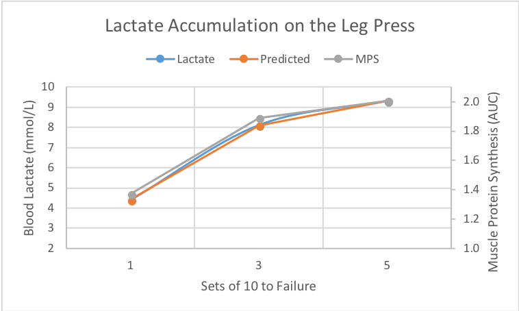
Things are looking fairly good now. We can take the number of reps done with any RIR for an exercise and predict lactate after three sets. But it would be nice to make predictions for other numbers of sets too. Gorostiaga et al. conducted research that can help us out there. They had participants do sets of 10 to failure on the leg press and measured metabolite concentrations after 1, 3, and 5 sets. Let’s plot that out so we can see how it looks. And, of course, we should also see how our 3 set prediction of the leg press using the modified exertion load stacks up against an independent study.

The modified exertion load prediction looks right on target. At this point, we’ll need to take a little bit of liberty and assume that this multiple set curve is the same for other exercises. I don’t mean the height specifically, because that changes from exercise to exercise (see highest lactate on the bench and squat graph above). Instead, I mean the shape of the curve from 1 to 5 sets, more specifically, how it tapers off. Let’s assume that stays the same and only shifts up or down overall depending on the exercise. Any objections? Let me know.
We can now add the number of sets to exertion load and adjust things so that the formula outputs a curve that increases the same way.
For those keeping scores, modified exertion load now uses four variables:
- Reps done (REPS)
- Reps in reserve (RIR)
- Range of motion (ROM)
- Number of sets (SETS)
“Just tell me how to get big.”
Okay, you might be wondering how all this lactate stuff relates to more than academic discussions. No problem, I think I can whet your appetite a little bit. We’ve now got a good model for predicting metabolic stress, but what’s even more interesting is how well that relates to say muscle protein synthesis (MPS). I can’t say this is anything more than correlation but MPS on 1, 3, and 5 sets nearly perfectly follows the lactate curve (study done on rats).
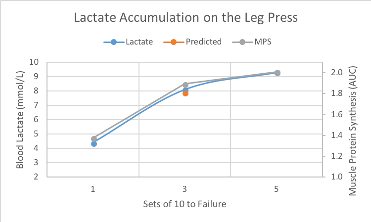
In that study, Ogasawara et al. actually measured up to 20 sets and concluded that effects on MPS plateau around 3-5 sets. Since MPS seems to mirror lactate accumulation, it seems modified exertion load should also be able to predict MPS.
Here’s how it looks now.
The modified exertion load is now able to make predictions about metabolic stress and muscle protein synthesis. That put’s it squarely in the hypertrophy prediction game.
New Fingerprints/Limitations
1: Set-to-set accumulation of lactate is assumed based on only what happens in the leg press.
2: I have not accounted for the effects on lactate accumulation of trickier rep/set combinations such as doing one set to failure followed by another set with half the reps and then repeating another cycle of failure/half reps. I doubt that changing exercises would change the lactate curve but adding rest sets between work sets would most likely change the set-to-set curve.
About those orphaned final reps
This is where things get interesting.

Across a set, ammonia remains close to baseline levels (<60umol/L), then jumps up in the last reps before failure. Those last reps seem to cross a critical threshold. It’s been theorized that sharp increases in ammonia concentration signify excessive breakdown of ATP, the energy source needed for muscle contractions. ATP is normally used and then recycled back to ATP. An ammonia spike means that some ATP was completely trashed to the point that it could not be recycled, and this might be part of what leads to a longer recovery process.
Something else interesting about ammonia concentrations is that unlike lactate, they do not depend on the exercise used. For ammonia, the only variables that really matter are Sets, Reps, and RIR. Previous research has demonstrated a non-linear relationship between lactate and ammonia, however, lactate depends on the exercise as we’ve seen above. So the lactate-predicts-ammonia relationship does not generalize beyond one exercise. Maybe modified exertion load can do better? Of course!
Okay, now it seems exertion load is just showing off. Let’s get to some practical stuff.
It’s fingerprint time again (not really)
I know I made a big deal about not making any assumptions and what follows are some big assumptions, but don’t pack up yet. The modified exertion load formula is really good at generating numbers that reflect actual measured numbers. So that part is all fine. What we’re about to do is try and derive meaning from those numbers. We can guess what they mean — and be completely wrong — and that would not take anything away from the numbers themselves.
That said, let the guessing begin. Here is a chart showing where ammonia crosses that critical threshold mentioned above. This is only dependant on Sets/Reps/RIR so it should apply to any exercise.
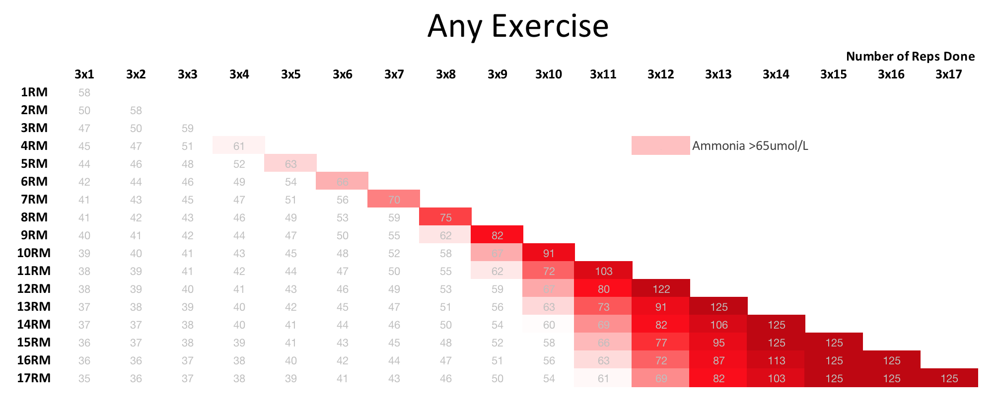 Ammonia levels really go through the roof with high rep sets. As mentioned, that might be related to why it seems to take longer to recover from high rep sets. If so, this chart could give us some useful info about constructing Set/Reps/RIR combinations.
While we’re at it, let’s also take a look at lactate in a similar way and mark off where it crosses the lactate threshold, often used as an aerobic training landmark. In this case, the numbers for lactate are dependant on the exercise, so I’ll show you the squat here. Ammonia stays the same. If you want to cross the lactate threshold and stay shy of the ammonia threshold, it looks like you have a lot of training options for the squat.
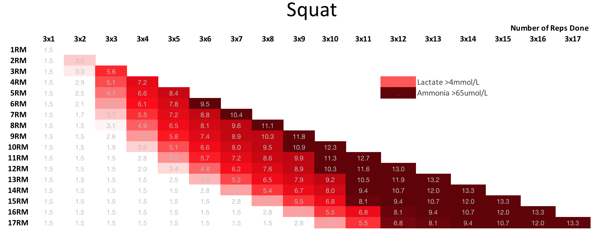
This is open for debate, but 3×8@9RM looks like it maximizes lactate stress and comes in just under the point of excessive ATP breakdown.
Great, how do I use it?
I’ve built this into the app. It’s free to use. Plug in your program and it’ll spit out the numbers for you to digest. It’s as easy at that. Want to see an example? Here’s Phase I (y-axis units are arbitrary). It’s a four-week introduction to the main lifts for people just starting out with barbell training. The first week begins with goblet squats and relatively light weight. Over the next few weeks, you trade that for squats to a high box, squats to a box at parallel, and then finally a full squat. At the same time, the weights increase from week to week.
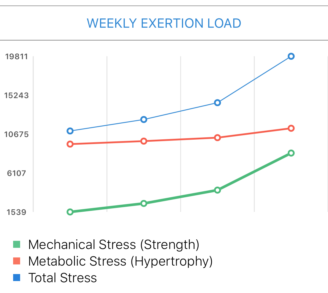 You can see the accumulation of mechanical stress across the weeks with relatively stable metabolic stress. This makes sense because our objective here is to learn the lifts and progress upwards in terms of movement complexity. So this graph gives us a way to spot check our programming to make sure everything looks in order.
Phase II then switches to place the primary emphasis on hypertrophy once you’ve developed some competence with the barbell lifts.
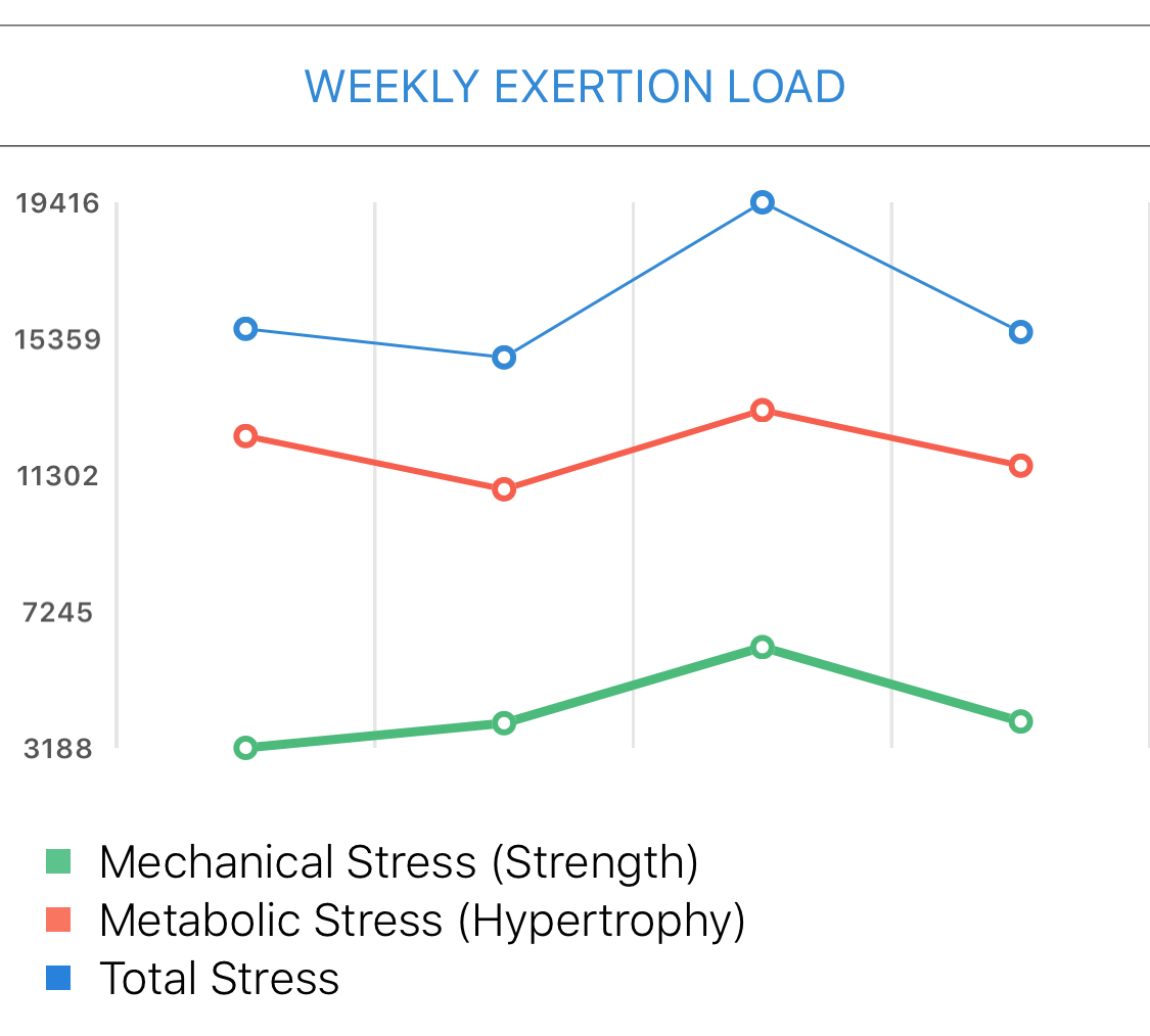
Phase II also adds a fourth weight training day to the week but cuts down on the PR attempts. This trades a little bit of intensity for volume. Notice that total stress peaks around the same level for both Phases I & II, so there should be a smooth transition between the two. The macro view looks in order.
At the micro level, we can take a look at the design of individual exercise set schemes.
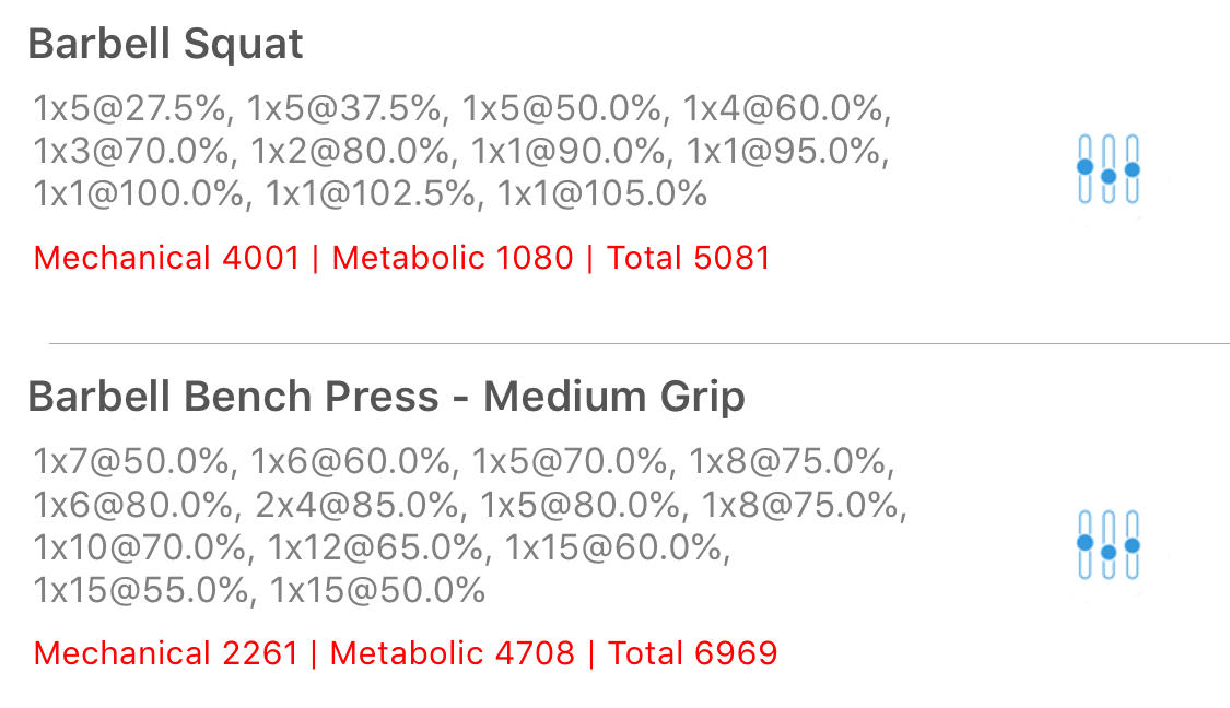 Here we compare 1RM testing for the squat, which we’d expect to generate a lot of mechanical stress, to a volume-based bench pyramid that generates a lot more metabolic stress.
Using both the macro and micro views, we can more intelligently construct training programs that achieve the specific effects we’re looking for, at some point in time.
If you want to plug in your training program and see how it looks, download the app if you haven’t already done so.
Download Strongur
One more thing…
I want to throw a couple bones out to proponents of a few ideas. I came across these things when looking over the data and thought you’d be interested in seeing these too.
Effective Reps
There’s an idea that only certain reps in your set count towards hypertrophy. Proponents of this theory state that either heavy weights that cause slow reps or reps near the point of failure are the ones that matter. As the point of failure is approached, the contribution of each rep grows.
That idea looks very similar to the profile of lactate across individual sets in different rep ranges.
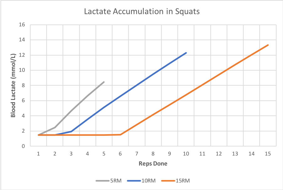
Here you can see a set with a 5RM starts increasing lactate much earlier than with a 15RM. In fact, the first 6 reps of a 15RM effectively create no metabolic stress. The problem is, how do you extract the hypertrophy stimulus from this? Maybe you count all reps above a certain threshold (say 4mmol/L). So doing a 5RM gives you three effective reps, while a 15RM gives eight. Or maybe the stimulation of each rep increases in parallel with the increase in metabolic stress. So the 4th rep of a 5RM is about double the stimulation of the 2nd rep. There might also be an upper cutoff point where there is no additional stimulation from additional reps.
These uncertainties can allow a lot of flexibility when trying to find supporting evidence. Remember how uncertainty multiplies with each step? There would certainly be a lot of uncertainty in this part of the logic chain.
Optimal Hypertrophy Range
Debate about the existence of an optimal hypertrophy range is in vogue right now. Several studies have demonstrated that similar hypertrophy can be achieved across a large swath of the entire rep range. That’s all very interesting but the proponents of the existence of a narrower range are focused on “optimal” as a defining keyword. In other words, what works best.
I’ll quote hypertrophy specialist Brad Schoenfeld blogging about one of his studies (emphasis mine):
The study provides evidence that training with heavy loads helps to maximize muscle strength and training with moderate loads promotes greater increases in muscle mass. Importantly, these findings are specific to routines where the number of sets are equated. At face value, this is consistent with the “strength-endurance continuum” and supports what gym bro’s have been preaching for years in regards to rep ranges.
He later goes on to construct the argument that when training volume is equated, hypertrophy is the same, therefore, no hypertrophy range. But here’s the thing, this is only an academic argument because in reality, people that use moderate loads more commonly train with higher volumes. Why? Simply because they can. It’s a matter of practicality and training economy. It’s a lot easier to do 3×10 to failure than 7×3 to failure workout after workout. That’s where we bring back the “optimal” keyword and repeat the question, “What is optimal for hypertrophy?”.
Let’s ask Brad, again. He also implies that this is largely an academic argument.
While mechanistically it appears that it does not matter whether heavy or moderately-heavy weights are used for hypertrophy, from an application standpoint it simply isn’t practical to train constantly with the volumes used in this study on multiple body parts. The grinding on the joints and the taxation of the neural system that is involved with repeated performance of very heavy loads ultimately has a negative impact on the lifter; I am certain that if we had continued this program for any longer, most of those in the ST[heavy load] group would have been overtrained and seen performance decrements.
That said, I promised more data to look at. Both mechanical and metabolic stress are currently thought to contribute to hypertrophy. In the following graph, I’ve plotted both profiles and added an interaction plot between mechanical and metabolic stress. The interaction plot suggests that the stress of both is maximized with sets between 8-12 reps. This is normally how you conduct an optimization analysis, by the way.
Caveat: You might not always want to emphasize both components (mechanical and metabolic). For example, the calf muscles don’t respond well to low rep, heavy weights.
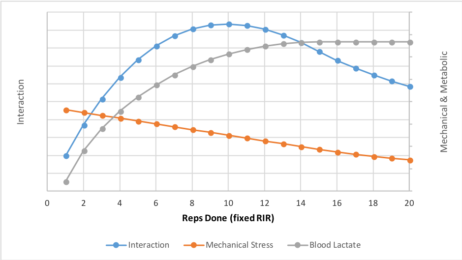
I don’t know about you guys but when I want to get my swell on, I’m doing sets of 10.
Relevant Recent Research
Cerda-Kohler et al. recently investigated the lactate’s role in hypertrophy. They injected lactate directly into the muscles of rodents and then dissected them 40 minutes later. They found evidence to support the hypothesis that lactate plays a role in the molecular signaling of hypertrophy in fast-twitch, but not slow-twitch muscle fibers.
